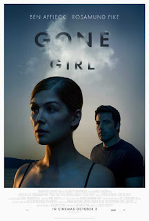
Title Design
Font: Tone
Utilize a sleek sans-serif font like Helvetica or Gotham for a modern look. Maintain consistency for a clean design. This is an example.
Contrast: Color
Ensure high contrast for readability. For instance, if the background is dark, use a light-colored font, and vice versa.
Size: Purpose
Emphasize the film title "Kidnapping in Style" with a larger font size, making it prominent. Other details can be in a smaller size for hierarchy.
How Titles Enter and Leave the Screen
Titles should come on dynamically, such as sliding in from the sides or fading in, providing an engaging entrance.
Titles should disappear with a fade after 3-5 seconds for a concise and effective display.
Working Title
"Kidnapping in Style"


Comments
Post a Comment